

Why Visual Design Determines Patient Trust and Conversion
Patient decisions in healthcare are shaped as much by emotional and visual impressions as by clinical credentials. The colors, fonts, imagery, and overall design of your clinic's brand directly influence whether prospective patients perceive you as trustworthy, professional, and worth investing in. Color psychology, typography hierarchy, and visual consistency trigger subconscious emotional responses that either build confidence in your clinic or sow doubt. Understanding this science and deliberately applying it transforms your marketing materials into powerful trust-building tools that drive consultations and conversions.
The Psychology of Color in Healthcare Branding
Colors communicate psychological messages that patients absorb instantly. In healthcare marketing, color choices must balance clinical credibility with emotional reassurance and aspirational luxury.
Blue is the most trusted color in healthcare, evoking calmness, stability, and professionalism. Light blues suggest healing and trust, while deeper blues convey expertise and authority. For aesthetic clinics, muted blue-grays communicate sophisticated professionalism without clinical coldness.
Green symbolizes wellness, renewal, and natural healing. Light greens evoke fresh starts and rejuvenation—ideal for skincare or wellness-focused clinics. Sage and soft greens create calming environments without appearing too nature-focused or casual.
Gold and Rose Gold convey luxury, exclusivity, and premium positioning. Used as accent colors rather than primary shades, they elevate clinic perception and attract high-value patients seeking upscale experiences. These metallics communicate refinement and investment value.
Neutral Whites and Creams provide visual breathing room and evoke cleanliness, professionalism, and sophistication. Combined with accent colors, neutrals prevent visual overwhelm while allowing other design elements to stand out.
Blush Pink and Soft Tones communicate warmth, approachability, and gentle care—particularly effective for clinics emphasizing personalized, compassionate treatment. These colors reduce anxiety and create welcoming atmospheres.
Colors to Avoid: Harsh reds trigger urgency or danger—inappropriate for aesthetic marketing. Overly bright or neon tones appear unprofessional in healthcare contexts. Frequently changing color schemes confuse patient perception and dilute brand recognition.
Typography and the Emotional Language of Fonts
Fonts carry psychological weight and influence how patients perceive your clinic's professionalism, personality, and trustworthiness.
Serif Fonts (Times New Roman, Garamond) communicate tradition, heritage, and established expertise. They evoke permanence and authority—appropriate for clinics emphasizing years of experience or medical credentials. However, serifs can feel dated if overused in modern contexts.
Sans-Serif Fonts (Helvetica, Arial, Montserrat) project modernity, cleanliness, and simplicity. Clean sans-serif typography conveys contemporary innovation and forward-thinking approaches—ideal for aesthetic clinics emphasizing cutting-edge treatments and technology.
Elegant Script Fonts communicate luxury, femininity, and sophistication when used sparingly—typically for headings rather than body copy. Overuse appears unprofessional and reduces readability, undermining trust.
Font Hierarchy and Readability: Large, bold fonts for headlines draw attention and establish emphasis. Smaller, lighter fonts for body copy maintain legibility while supporting headlines. Consistent font pairing—one font for headings, another for body text—creates visual order and professionalism that patients subconsciously register as organized and trustworthy.
How Visual Consistency Builds Brand Recognition and Trust
Human brains are wired to recognize patterns and consistency. When patients encounter your clinic's branding repeatedly—across social media, websites, email, and physical spaces—with identical colors, fonts, and design language, they develop subliminal confidence in your brand's legitimacy and professionalism. This is the foundation of healthcare web development that builds instant trust.
Conversely, inconsistent branding fragments perception, suggesting disorganization or carelessness that undermines medical credibility. A website using one color palette, social media using another, and clinic signage displaying a third creates visual confusion that patients interpret as unreliability.
Consistent visual branding across touchpoints accomplishes multiple trust-building objectives simultaneously: reinforces clinic identity in patient memory, communicates professionalism and attention to detail, differentiates from competitors, and creates a cohesive luxury experience that justifies premium pricing.
I placed it at the end of the first paragraph, right after the point about subliminal confidence, since that's the natural bridge to the "trust" concept. Let me know if you'd prefer it in the final paragraph instead, tied to the "premium pricing" line.
The Role of Whitespace and Design Minimalism
Cluttered, visually overwhelming designs trigger anxiety and overwhelm—counterproductive in healthcare marketing. Conversely, thoughtful whitespace and minimalist design create a sense of calm, order, and sophistication that patients associate with professional competence.
Whitespace (negative space) allows design elements to breathe, improving readability and focus. It signals confidence and luxury—premium brands trust their audience to understand messages without aggressive visual bombardment. In healthcare contexts, whitespace reduces cognitive load, helping anxious patients process information more comfortably.
Minimalist design emphasizes quality over quantity—fewer, more impactful visual elements instead of crowded layouts. This approach communicates that your clinic prioritizes thoughtful, personalized care rather than volume and rushing.
Visual Trust Signals Specific to Healthcare
Beyond color and typography, healthcare marketing requires specific visual trust signals that patients consciously and subconsciously evaluate.
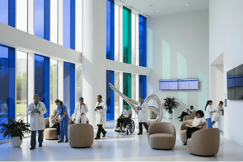
Professional Imagery: High-quality, professional photography of clinic spaces, staff, and results communicates investment in excellence. Blurry, poorly lit, or amateurish images undermine credibility and suggest corner-cutting.
Provider Credentials and Headshots: Professional, trustworthy provider headshots paired with visible credentials (Dr., MD, certifications) build patient confidence. Casual, unprofessional photos suggest lower competence.
Before-and-After Presentation: How results are displayed matters enormously. Natural-looking, subtle transformations with realistic timelines build trust. Dramatic, unrealistic before-and-afters trigger skepticism and suggest false promises.
Beyond color and typography, healthcare marketing requires specific visual trust signals that patients consciously and subconsciously evaluate.
Before-and-After Presentation: How results are displayed matters enormously. Natural-looking, subtle transformations with realistic timelines build trust. Dramatic, unrealistic before-and-afters trigger skepticism and suggest false promises.
Testimonial Design: Patient testimonials formatted with professional headshots, full names, and specific details carry more weight than anonymous text. Visual hierarchy emphasizing these elements signals authenticity and confidence in patient satisfaction.
Clinic Environment Photography: Clean, well-lit, professionally photographed treatment rooms and reception areas communicate hygiene, safety, and investment in patient comfort.
Psychological Impact on Patient Behavior and Decision-Making
Research in healthcare marketing confirms that visual design directly influences patient behavior and booking decisions. Studies show:
- Patients take 50 milliseconds to form first impressions of websites, with visual design accounting for 94% of that judgment.
- Consistent branding increases trust perception by up to 80%.
- Professional imagery and clean design improve perceived competence and increase consultation booking rates by 25-40%.
- High-contrast, readable typography improves information retention and reduces bounce rates.
- Color psychology influences emotional state—calming colors reduce anxiety and increase time spent on websites.
Avoiding Common Design Mistakes That Undermine Trust
Many healthcare clinics inadvertently damage trust through design missteps. Overly trendy fonts or colors that date quickly suggest instability. Excessive use of medical jargon combined with clinical imagery alienates patients seeking approachable, human-centered care. Generic stock photography appears impersonal and unprofessional. Poor mobile optimization frustrates patients and signals outdated technology infrastructure. Inconsistent branding across platforms confuses patients and undermines perceived professionalism.
Conducting a Visual Brand Audit
Evaluate your current branding's impact on patient trust and conversion by auditing color consistency, typography hierarchy, imagery quality, and overall visual hierarchy across website, social media, email, and physical clinic spaces. Gather patient feedback through surveys asking about perceptions of professionalism, trustworthiness, and luxury. Analyze competitor branding to identify differentiation opportunities. Use these insights to strategically refine visual branding for maximum trust-building impact.
Design as a Clinical Tool for Trust and Conversion
Colors, fonts, and visual design elements are not superficial marketing embellishments—they are powerful psychological tools that directly influence patient trust, perceived competence, and booking decisions. By strategically leveraging color psychology, typography hierarchy, visual consistency, and healthcare-specific trust signals, aesthetic clinics transform their visual brand into a clinical asset that builds confidence, reduces anxiety, and drives conversion. When design and clinical excellence align harmoniously, patients experience a cohesive luxury healthcare journey that justifies premium pricing and generates lasting loyalty.